February 5, 2019 · 5 minute read
Missing value visualization with tidyverse in R
A short practical guide how to find and visualize missing data with ggplot2, dplyr, tidyr

Finding missing values is an important task during the Exploratory Data Analysis (EDA). They can affect the quality of machine learning models and need to be cleaned before training models. Detecting the missing values let’s you also evaluate the quality of your data retrieval process. This short practical guide will show you how to find missing values and visualize them with the tidyverse ecosystem. tidyverse is a collection of R packages for data science. It says on their homepage that “…all packages share an underlying design philosophy, grammar, and data structures.”
The dataset
The dataset is scraped from a eCommerce website and contains product data. You check the quality of the data retrieval by evaluating the missing values. A feature with a lot of missing values might be a indicator for a problem with the extraction logic for that feature or the data is missing due to other reasons.
{% highlight r %}
df %>%
head(10)
{% endhighlight %}

The dataset consists of 11 variables with 2172 rows.
Table with missing values
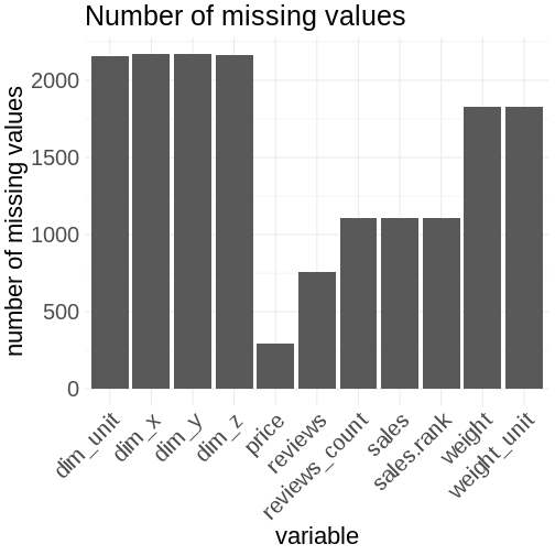
You can count the values of missing values for each feature in the dataset:
{% highlight r %} missing.values <- df %>% gather(key = “key”, value = “val”) %>% mutate(is.missing = is.na(val)) %>% group_by(key, is.missing) %>% summarise(num.missing = n()) %>% filter(is.missing==T) %>% select(-is.missing) %>% arrange(desc(num.missing))
{% highlight text %}
summarise() regrouping output by ‘key’ (override with .groups argument)
{% endhighlight %}

You can use the gather function from tidyr to collapse the columns into key-value pairs. Then you create a new logical feature which is true in case of a missing value. You group on the key and the new logical feature to do a count. Then you filter on the logical feature to get the count where the value is missing. You skip the rows which are not needed and sort by the number of missing values.
Visualize missing data
Tables with their rows and columns are read by our verbal system. This system is very slow.
Graphs interact with our visual system, which is much faster than the verbal system. This is the reason why in most cases you should use graphs instead of tables.
You can visualize the aggregated data set from above with a simple bar chart in ggplot2:
{% highlight r %} missing.values %>% ggplot() + geom_bar(aes(x=key, y=num.missing), stat = ‘identity’) + labs(x=’variable’, y=”number of missing values”, title=’Number of missing values’) + theme(axis.text.x = element_text(angle = 45, hjust = 1))
You can improve this plot by calculating the percentages of missing values for each feature. This is more meaningful. The visual appearance can be improved by swapping the axes to make the feature names more readable. Sorting the bars by it’s length is another improvement. Proper axis labeling is always a must. The use of the color red as a visual cue for the missing values (=bad) is used as red stands for danger and that you have to act.
{% highlight r %} missing.values <- df %>% gather(key = “key”, value = “val”) %>% mutate(isna = is.na(val)) %>% group_by(key) %>% mutate(total = n()) %>% group_by(key, total, isna) %>% summarise(num.isna = n()) %>% mutate(pct = num.isna / total * 100)
{% highlight text %}
summarise() regrouping output by ‘key’, ‘total’ (override with .groups argument)
{% endhighlight %}
{% highlight r %} levels <- (missing.values %>% filter(isna == T) %>% arrange(desc(pct)))$key
percentage.plot <- missing.values %>% ggplot() + geom_bar(aes(x = reorder(key, desc(pct)), y = pct, fill=isna), stat = ‘identity’, alpha=0.8) + scale_x_discrete(limits = levels) + scale_fill_manual(name = “”, values = c(‘steelblue’, ‘tomato3’), labels = c(“Present”, “Missing”)) + coord_flip() + labs(title = “Percentage of missing values”, x = ‘Variable’, y = “% of missing values”)
percentage.plot
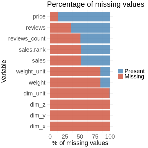
You aggregate the data in a similar way for this plot as before: Instead of counting you are calculating percentages. The data is then chained to the ggplot visualization part.
The plot shows you that you have problem in the scraping process with the features for product dimension (dim_x, dim_y, dim_z): Almost 100% of the values are missing. You can see that there is the same amount of missing values for sales.rank, sales and reviews.count. These values seem correlated with each other.
You can visualize the missing values in another way by plotting each row in the dataset to get further insights.
{% highlight r %} row.plot <- df %>% mutate(id = row_number()) %>% gather(-id, key = “key”, value = “val”) %>% mutate(isna = is.na(val)) %>% ggplot(aes(key, id, fill = isna)) + geom_raster(alpha=0.8) + scale_fill_manual(name = “”, values = c(‘steelblue’, ‘tomato3’), labels = c(“Present”, “Missing”)) + scale_x_discrete(limits = levels) + labs(x = “Variable”, y = “Row Number”, title = “Missing values in rows”) + coord_flip()
row.plot
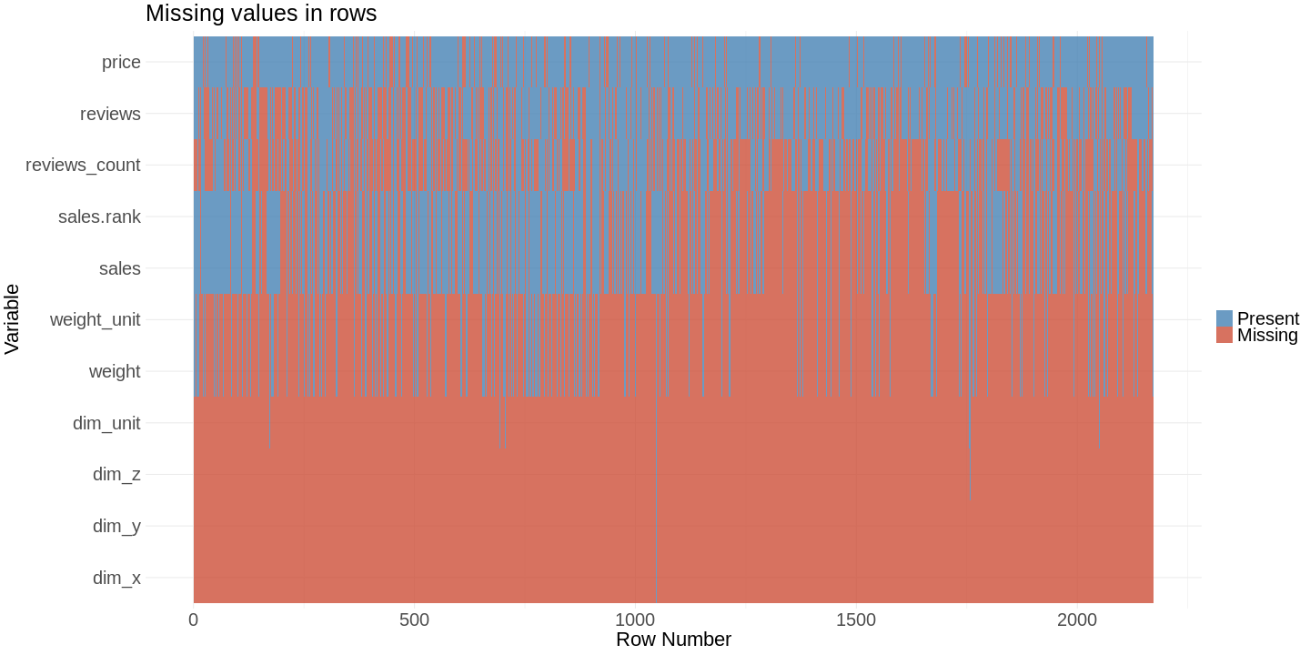 This plot lets you find patterns which cannot be found with our bar chart. You can see links between missing values for different features.
The missing values for the features sales_rank and and sales are indeed linked to each other. This is what you expect. In the bar chart you could see that reviews_count has about the same percentage of missing values. You would expect a linkage to sales and sales rank. Our second plot shows that there is no linkage, because the value is missing in different rows.
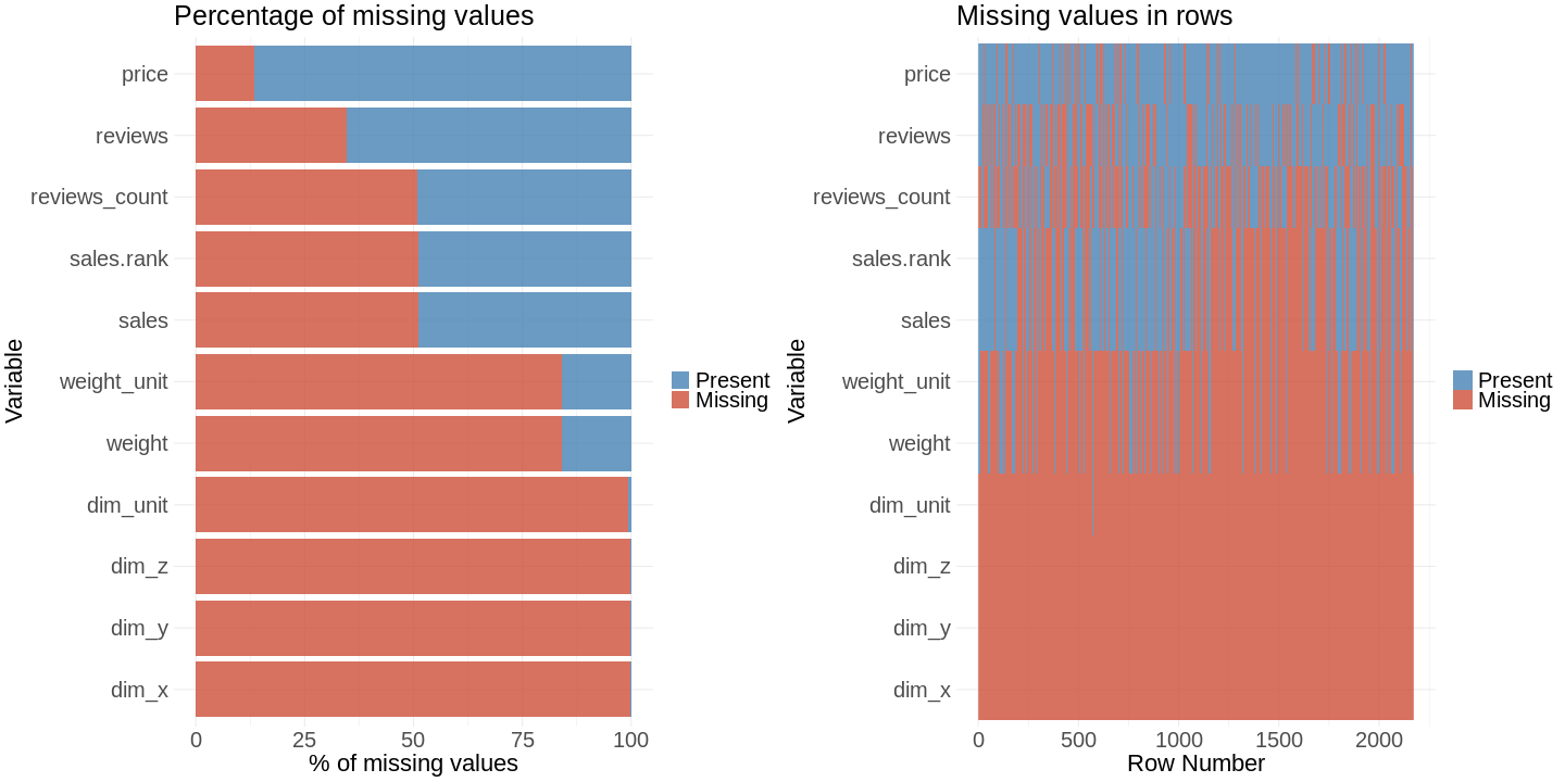
You can put the two visualizations into one with the gridExtra package.
{% highlight r %} grid.arrange(percentage.plot, row.plot, ncol = 2)
Conclusion
You visualized missing values in a data set in two ways, which provided you different insights on the missing values in the data set. This way you could find weak points in the data scraper logic. You could see how the grammar of graphics in ggplot2 and the grammar of data manipulation in dplyr are a very powerful concepts.